Saturday, July 30, 2011

Annotating a 1643 English-Latin Phrase Book

Traveling has kept me away from the blog for a little while, but today’s post will be the first in a series of uninterrupted weekly entries as we continue into August and finish up the summer. The book I am highlighting today is a copiously annotated dictionary used by an English book owner in the Restoration and early eighteenth century. The Center owns several books with manuscript-enhanced dictionaries, indices, and reference guides, but this is the first one to make it onto the web.

note the faint pen trials

Johann Amos Comenius (Jon Amos Komenský), Janua linguarum reserata (The Gates of Languages Unlocked: or a Seed-Plot of all Arts and Tongues; containing a ready way to learn the Latin and English Tongue). Sixth Edition. London: Printed by James Young, and are sold by Thomas Slater, 1643.
[376] p. ;  18 cm. (8vo); Wing C5512 
Renaissance Center copy is in later half calf and marbled boards (covers largely detached) 

Appearing in over fifteen editions between 1631 and 1672, this portable English-Latin phrase book belongs to one of several different groups of books published in seventeenth-century England under the title Janua linguarum, or "the gates of languages" (literally "gates of tongues"). While this particular book presents a bilingual guide, others might have been trilingual (Comenius' own Janua linguarum trilinguis and Porta linguarum trilinguis with English, Latin, and Greek), quadrilingual (William Bathe's Janua linguarum, first pub. 1617 in English, Latin, French, and Spanish), or even "silingual" (the 1629 and 1630 editions of Bathe add German and Italian). For English publication disputes over Janua linguarum and a table of English editions, see Adrian Johns, The Nature of the Book: Print and Knowledge in the Making (Chicago: University of Chicago Press, 1998), pp. 223-6.

Comenius (1592-1670) was an early proponent of universal education and his published works (especially Janua linguarum) were heavily used in European schools (the book also appeared in Continental editions). The popularity of Janua linguarum even prompted authors to compose companion volumes. Jean de Grave wrote a "path-way to the gate of tongues" in 1633, intended as an introduction to Comenius' book for "little children" (STC 12198, often bound with the 1633 edition of Porta linguarum trilinguis). Wye Saltonstall's Clavis ad portam, or a key fitted to open the gate of tongues appeared in 1634, and it too is often found bound with Porta linguarum (ESTC).

The Center's copy is from the 1643 sixth edition of the bilingual Janua, which was "carefully reviewed, and exactly compared with all former editions, foreign and others, and much enlarged both in the Latin and English" by John Robotham (who had also corrected and amended the text in an earlier edition). Our particular copy bears several marks of provenance, recording the association of the book with four different English readers/owners.


eighteenth- or nineteenth-century inscription of "Geo[rge] Jepson"

The second image contains several seventeenth-century inscriptions. They read (in three separate hands):

John Widdowes His Booke
anno dom: 1667 [all struckthrough]

George Yardley His Booke

              1670

George Yardley Liber Eius
Testis Antonius Meeke 1672


From these notes we know that around 1670 the book passed from John Widdowes to George Yardley (who struck out the earlier inscription). The third inscription appears to be in the hand of Anthony Meeke, who has "witnessed" Yardley's ownerships of the book ("testis" means "witness"); it also plays on the common ownership formula "hic liber est meus, Testis est Deus." I have been unable to identify the Greek note at the bottom of the page, which I believe is in Yardley's hand. 

Two other pages contain Greek and Latin notes in the same hand:


unidentified Greek note

"Foemineum servile genus, crudele, superbum" ("womankind is servile, cruel, [and] proud"). From the fourth eclogue of Baptista Mantuanus' Bucolica (first pub. 1503)
An additional (much later) ownership inscription provides more information about our annotator, George Yardley.


Written fifty years after the first inscription (which seems to have been penned by a youth), Yardley's later note is the product of an Anglican clergyman: "A[ssembly].M[inister]. & R[ector] de Notgrove" and "V[icar] de Mickleton." According to British History online, George Yardley attained the post of rector at Notgrove in 1687. To be found in the Mickleton Parish Records (Gloucestershire Archives) is a collection of "[p]rinted almanacs interleaved with manuscript notes, which belonged to Rev George Yardley, Rector of Notgrove and Vicar of Mickleton 1707-1746." (Yardley died in 1746, and his printed almanacs range from 1718-1745.) This note is dated July 20, 1730.

As I mentioned in this entry's headnote, one of the book's former owners (probably Yardley) copiously annotated the two indices that conclude this copy of Janua linguarum. While I don't think paleographical evidence presents a conclusive case for any of the former owners, considering Yardley's known practice of adding manuscript notes to printed books (as in his interleaved almanacs surviving among the Mickleton Parish Records), it seems likely he is the annotator of the indices. The book's first index, the Latin "index vocabulorum," is prefaced by an interesting note about John Robotham's editing of its content:


"The former Index, even in the Dutch copy, was very faulty in the cyphers, and defective in many words; which put me to a needlesse trouble, in striving to insert in the text, such words as I found not in the Index (and therefore thought them lacking) which afterward I met with in the book. This Index is very exact; and may serve as a Dictionary to the learner, and a ready helpe to him that would adde any further supply to the booke it selfe."

The passage is interesting for a few reasons. We know these indices (one of Latin words, the other of English) were "very faulty" in earlier editions, forcing the Janua's English editor to augment the lists with additional entries. The editor also claims the lists "may serve as a Dictionary to the learner," and may even be "a ready helpe to him that would adde any further supply to the booke it selfe." In other words, these printed lists form a complete and "exact" English-Latin dictionary, which a reader may nonetheless supplement with a "further supply" of words in manuscript. 

The book's manuscript annotations respond directly to Robotham's invitation to "adde" such "a further supply" by inserting missing words (according to alphabetical order) into the body of the printed text. Here are three examples from the (less copiously) annotated Latin index:


Added words include abnormis, abramis, absis, adolesere, adultum, arteres, and culsium (with the added note "being compounded it wants the supine").

The "Index Anglicus" is much more heavily annotated and includes words in both English and Latin. Since nearly every page contains manuscript annotation, I have decided not to upload all thirty (or so) images, but instead post a range of images with representative annotation. In each image's caption I have listed some of the words added in manuscript (in modernized English).


acorn, adamant
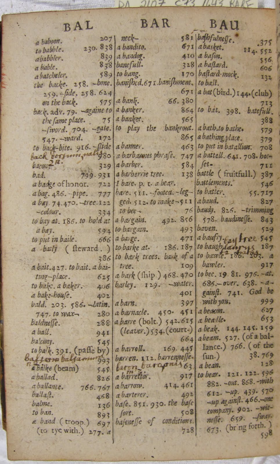
back, balsam, baron, bay tree
bemoan, bosom, beaver
bastard, camel, cane, capon, carbuncle, carp, carpet, carter, cates
cedar, cellar, center, ceremony, chariot, cherish, crystal, cheekbone, chickpeas, choler, chough
christ, circumference, circumstance, client, cocksure, colander, collar, colt
comfort, comedy, complete, compose, conical, constellation, conscience, consume, contempt, content, contest
The rest of the volume continues in the same way. With further archival research into books annotated by George Yardley and manuscript-enhanced copies of Janua linguarum, one could ask a number of interesting research questions about material reading practices, early modern education, and the development of the English language: how common was dictionary-annotation in early modern England? how did readers customize such books with manuscript notes? what sort of relationships existed among printed dictionaries, manuscript-enhanced printed dictionaries, and manuscript word-lists? what can such annotations tell scholars about the history of our language?

Friday, July 15, 2011

Seventeenth-Century English Bindings II

Today's post concludes a discussion of seventeenth-century English bindings that I began a few weeks ago. As in my previous post, these entries offer representative examples of decorative styles commonly found on English bindings of the seventeenth century. David Pearson's English Bookbinding Styles, 1450-1800 (New Castle, DE: Oak Knoll Press and British Library, 2005) and Stuart Bennett's Trade Bookbinding in the British Isles, 1660-1800 (New Castle, DE: Oak Knoll Press and British Library, 2004) are essential companion volumes for anyone interested in the subject.

upper cover
lower cover

Richard Allestree, The Gentleman’s Calling.
London: Printed by R. Norton for Robert Pawlet, 1676 
8vo; contemporary calf binding, central frame formed from triple fillets in blind, outer frame from double fillets in blind; outer corners of central frame decorated with small tools in blind; late seventeenth century

upper cover
lower cover
 
William Fleetwood, Chronicon preciosum 
London: Printed for Charles Harper, 1707
Contemporary paneled calf, decorated in blind with small tools

The two books illustrated above exemplify the typical binding style of the Restoration and early eighteenth century, i.e. the "paneled" binding. This decorative concept became very popular in the last quarter of the seventeenth century, growing directly out of the minimalist design patterns used from 1600-1650. The multiple "panels" of a "paneled binding" are formed by layered frames made by blind fillets. It was common for binders to decorate the corners of these panels with small tools. 

The paneled design on the binding shown below adopts an even simpler form. The multi-tonal effect was created by treating parts of the leather with acid or ink, while the decorated lines were made by a "dog-tooth" tool in blind. An early owner inscribed the title page "Anne Jones her book February 20th, 1695/6" in a fine hand.


upper cover
lower cover
detail of panel design
detail of ms note on upper cover
title page inscription
title page inscription, detail
Simon Patrick, The Parable of the Pilgrim 
London: Printed for Richard Chiswell, 1687
4to; contemporary paneled calf binding, simply decorated in blind with dog-tooth rolls

Here is another example of a multi-tonal paneled calf binding from the period:

lower cover

Basil Kennett, Romae antiquae notitia: or, the antiquities of Rome 
London: Printed for T. Child and R. Knaplock, 1717
8vo; contemporary calf [only lower cover survives in original binding], triple-paneled style decorated in blind with small tools and simple rolls; outermost and innermost panels treated to create multi-tonal effect; early eighteenth century


And a final paneled binding from the early eighteenth century (the job executed in a rather slapdash manner):


James Welwood, Memoirs of the most material transactions in England for the last hundred years 
London: Printed by J.D. for Tom Goodwin, 1718
contemporary paneled calf, crudely (i.e. asymmetrically) decorated in blind with fillets, simple rolls, and small tools; early eighteenth century

Another popular decorative style for bindings of this period looks nearly identical to the plain bindings of the early seventeenth century (i.e. those decorated with a frame of fillets only), except it features a single decorated roll running parallel to the spine (see below).
 
upper cover
lower cover
detail of roll (1)
detail of roll (2)
title in ms on foreedge: "Secret His[tory] White Hall"

David Jones, The secret history of White-hall 
London: Printed by R. Baldwin, 1697
8vo; contemporary plain calf binding; outer frame formed by double fillets in blind, with decorated roll (c. 1645-1715) running parallel to spine; late-seventeenth-century/early-eighteenth century; title in ms on fore-edge

 
The last two bindings on display, as might be ascertained by their bright colors, illustrate the higher end (but by no means the highest end) of the period's decorative styles. The first item is a copy of Richard Allestree's The Ladies Calling (1705) handsomely bound in red morocco and adorned with gilt tooling; a manuscript poem "On New Year's Day" affixed to the front pastedown indicates the book was a holiday gift. In fact, Allestree's The Ladies Calling was extremely popular at this time (as were all of Allestree's devotional works), and its readers tended to spend the extra money to adorn it with a deluxe binding. Many extant copies of The Ladies Calling survive in more expensive bindings, which may have been made with goatskin, dyed in bright colors, and/or decorated with gilt tooling. 

As Stuart Bennett has argued persuasively in Trade Bookbinding in the British Isles, these bindings were not invariably bespoke, i.e. not necessarily commissioned by each individual book purchaser. Booksellers—especially those who owned shops while also participating in the wholesale trade as publishers—purchased much of the contemporary binding work seen on surviving books from this period (see Bennett for an important discussion of trade and publisher's bindings). The deluxe examples shown below would have been reproduced for multiple copies of the same book—in this case The Ladies Calling—primarily so that a bookseller could make the books (and his shop) more aesthetically pleasing to customers. 


upper cover
lower cover
spine
fore-edge

Richard Allestree, The Ladies Calling 
Oxford: Printed at the Theatre, 1705
8vo; contemporary red morocco, triple-paneled style decorated with gilt fillets and small tools
One more paneled binding decorated in gilt, similar in style to the Allestree but less deluxe (calf instead of goatskin). 
 
upper cover
lower cover
fore-edge
John Selden, Table Talk 
London: Printed for Jacob Tonson and Awnsham and John Churchill, 1696
8vo; contemporary paneled calf decorated with gilt fleurons and corner tools

Saturday, July 9, 2011

An Early Owner Rewrites Waller

Last week's post highlighted early seventeenth-century bindings from the Center's collection, a post I plan to continue with a discussion of English bindings in the Restoration and early eighteenth century. But in order to conduct a bit of extra research into our later seventeenth-century English bindings, I am saving that post for next week. 

Today's post, on the other hand, focuses on the manuscript emendation of printed poetry in a late seventeenth-century verse anthology. Besides documenting a specific historical reader of Edmund Waller's poetry, the material signs of this book's "use" reveal an amusing and perceptive close reading of a politically charged epithalamium. 

title page

detail of title page


The temple of death: a poem...Horace of the art of poetry...The duel of the stags, by the Honourable Sir Robert Howard: together with several other excellent poems by the Earls of Rochester and Orrery, Sir Charles Sedley, Sir George Etheridge, the Honourable Mr. Montague, Mr. Granvill, Mr. Dryden, Mr. Chetwood, and Mr. Tate. [second edition]
London: Printed by Tho[mas] Warren for Francis Saunders, [1695]
[16], 268, [2], 269-273, [3] p.: 19 cm. (8vo); Wing T663

Renaissance Center copy is in contemporary calf (front cover wanting; title leaf detached and mutilated, removing lower outer corner and some text; lacks N3-4 and the blank leaves A1, E8, F1, S8); in phase box; p. 206 has catchword "ON"; early signature of Sarah Kingsman (several times on title page, and elsewhere in the volume); signature of Mary Anne Tillwood (1837) on verso of title leaf; signature of Gwynne Blakemore Evans (1931) on title page and his bookplate on verso of title leaf [JL]

Within this printed verse miscellany is gathered a range of authors and literary forms. It showcases the lyric poetry of the day's most popular writers (Waller, Etherege, Dryden, etc.) and a number of less well known aristocratic poets. The book also presents commendatory verse, works of poetic theory (Horace, Waller), and a translation from the French (Philippe Habert's "Le temple de la mort," trans. by John Sheffield, Duke of Buckingham). 

An early owner named "Sarah Kingsman" has inscribed her name several times on the book's title page and elsewhere in the volume (as in its final page, shown below). The title page also bears the inscription of "Sally Idle," whereas a later owner's inscription (Mary Anne Tillwood-1837) appears on its verso. Kingsman's inscription within the capital "O" from "POEMS" is a particularly interesting specimen.

the notice at the bottom of the leaf advertises "all sorts of Gilt and Plain paper"
In the final poem of the volume (Edmund Waller's “On the Marriage of the Lady Mary with the Prince of Orange") one of these former owners (probably Tillwood, perhaps Idle or Kingsman) used her pen to strike out and insert a word in the author's text. 


Placed directly after Waller introduces the "triple knot" figure as representative of the pair's virtue, royal blood, and love, the original lines read

The Church shall be the happy place,
Where Streams which from the same Source run,
(Tho' divers Lands awhile they grace)
United there again make one.

Our early reader's version—rewritten in an amusingly satirical style—reads

The Bed shall be the happy place,
Where Streams which from the same Source run,
(Tho' divers Lands awhile they grace)
United there again make one.

Besides revealing her clever, slightly irreverent sense of humor, the change clearly reflects the reader's skepticism towards the Church as a space conducive to marital bliss.While I have not determined whether this emendation is the reader's own invention or a copy of similarly satirical changes to the poem found elsewhere, it may play off of greater topical vogues in contemporaneous satire. Mary II died in 1694 and William would rule until his death in 1702 (the pair came to power in the Glorious Revolution of 1689). It may well be that the manuscript alteration to Waller's poem reflects some satirical aspect of their reign or marriage (or both). But it is just as likely the reader is responding to the poem on a more localized level, exposing what she sees as sham rhetoric in a highly politicized (and idealized) discussion of marriage. By transforming the site of marriage from a sacred to a sexualized space with the stroke of a pen, this early annotator reveals how specific strategies of reading and writing  become manifest in the material elements of books, elements which (as this case illustrates) have a direct bearing on literary interpretation.

Friday, July 1, 2011

Seventeenth-Century English Bindings I

For the next two weeks I will be showcasing historical English bookbindings from the Center's collection. The images chronicle developments in the decorative styles and tool designs used to embellish leather and vellum book covers in the middle of the hand-press period. Since the majority of our early English bindings date from the seventeenth century, I am limiting my discussion to that era (1600-1650 this week, 1650-1720 next week). These posts are heavily indebted to David Pearson's invaluable English Bookbinding Styles, 1450-1800 (New Castle, DE: Oak Knoll Press and British Library, 2005).

upper cover
spine
lower cover
detail of lower cover
inside upper cover, showing binding structure
Francis Godwin, A Catalogue of the Bishops of England (London: Impensis George Bishop, 1601) 4to; contemporary limp vellum binding, with yapped edges and holes formerly occupied by leather ties; title in manuscript on spine; early seventeenth century (c.1601)

Besides paper wrappers, limp vellum bindings were the most common types of cheap book covers in the early seventeenth century. The vellum binding is "limp" because it is not stiffened over boards (at this time, pasteboard, made from pasting many pieces of paper on top of one another). This piece of vellum isn't particularly nice either. As shown in the last two images, the hair side of the vellum faces outwards, while the flesh side appears on the inside of the upper cover. Hair follicles are visible in the second-to-last image. 

upper cover
lower cover
William Lambarde, Archion (London: Printed for Daniel Frere, 1635); 8vo; contemporary plain sheep binding; framed in blind by double fillets; first half of the seventeenth century (c.1635)

Even the plainest bindings in the sixteenth century featured some element of decoration, be it a roll or pattern made from small tools. But in the early seventeenth century plain (and I mean very plain) calf bindings became popular. Bindings such as the one shown above were decorated with nothing more than fillets (the horizontal and vertical lines) in blind (i.e. without gold), creating an outer frame that formed a single rectangular panel. The binding of this pocket-sized octavo book represents the lower end of leather bindings available in the early seventeenth century: not only is it plainly decorated, but it is also bound in sheep leather, a notoriously perishable material that tears easily and apparently bred worms (Pearson 18-19; 190, n.3).

upper cover
lower cover
Nicolas Faret, The honest man, or, The art to please in court. Translated by Edward Grimeston (London: Thomas Harper for Edward Blount, 1632) 12mo; contemporary plain calf binding; framed in blind by double fillets; one of five copies in North America (others at Folger, Harvard, Yale, Huntington), eleven in the world; first half of the seventeenth century (c.1632)

Here is another cheaply bound pocket-sized book from the 1630s, this time a duodecimo bound in calf leather. Even this book's original spine (ragged as it is), survives and has not been rebacked in the modern era. 

Despite the popularity of the plain leather style, other aesthetic trends in early seventeenth-century English binding called for elaborate stamp designs. As in the cases of the following two books, one is more likely to find gilt decorated stamps on folio volumes than smaller formats, although there are always exceptions to the rule.

upper cover
lower cover
Michel de Montaigne, Essays. Translated by John Florio (London: Melchisidec Bradwood for Edward Blount and William Barret, 1613) folio; contemporary calf; triple-fillet frame in blind, with gilt centerpiece panel; c. first half of seventeenth-century (c.1610s-20s). 

Another popular design in the early seventeenth century, the "centerpiece" style consists of an outer frame composed of blind fillets and a central panel stamp design, usually gilt. The strapwork characteristic of many centerpieces reflects arabesque design trends popular in England at the time. While sixteenth-century English bindings also utilized centerpieces, such work not only employed additional designs in the corners (made from small tools) but also used different types of centerpieces. 

upper cover
detail
lower cover
Guilliaume Du Bartas, Divine Weekes and Workes (Sepmaine). Translated by Joshua Sylvester (London: printed by Robert Young, 1633) folio; contemporary calf, with center- and cornerpiece design framed by gilt single fillets; small tools decorating outside corners of frame; c. 1635-1640 

It was also common for bindings to combine the centerpiece with corner stamps to make even more elaborate designs. The cornerpiece shown in the second image was commonly used from 1590-1655 (Pearson 135, pl. 5.16). The centerpiece and center-and-cornerpiece designs rose to prominence in the 1620s.

upper cover

spine (rebacked)

lower cover

remnant of green linen tie

detail, holes for ties
Thomas Sternhold, The whole booke of Davids Psalmes : both in prose and meeter : with apt notes to sing them withall (London: Co. of Stationers, 1635) 16mo; contemporary calf binding with elaborate gilt panel stamp on both covers; remnants of green ribbon ties; gilt edges; c. 1635-1650; one of four copies in North America (fifteen worldwide) 

Binders also used elaborate centerpiece stamps to decorate small-format books, especially devotional books in 12mo and 16mo (Pearson 57-9). This type of design was common from the late sixteenth century to the first quarter of the seventeenth, and began to decline in popularity from 1625-1650. This elaborately decorated 1630s Psalter appears to feature such a stamp, although the decoration is actually made up from separate small tools. The binding bears remnants of ties made from green linen, which along with leather were the most common materials used for book-ties in this period. Ties made from leather, linen, or (rarely) silk came into use in England around the same time bookmakers began shifting from wooden boards and vellum to pasteboard and paper (the natural expansion of vellum leaves necessitated the use of metal clasps to keep medieval and early printed books closed). 

upper cover
detail of upper cover
lower cover
detail of lower cover
William Cartwright, Comedies, Tragi-comedies, with other Poems (London: Printed for Humphrey Moseley, 1651) 8vo; contemporary plain calf binding, with additional vertical line tooled parallel to spine (creating two panels); small tools used to decorate corners of each panel thus formed; mid-seventeenth century (c. 1651)


By the middle of the seventeenth century a new style of plain leather binding came into fashion; as with those produced in the earlier part of the century, minimalism was the dominant aesthetic for these bindings. Here the basic outer frame of blind fillets is augmented with an additional vertical line, and the two asymmetrical panels thus formed feature small corner decorations. Some bindings dispensed with these small decorations, as can be seen in this example from the 1670s:

upper cover

lower cover
Anyway, the plainer, more spacious designs of the early seventeenth century would greatly influence the dominant binding aesthetic in England from 1650-1720, which I will discuss in greater length next week. 

Incidentally, the copy of William Cartwright's plays and poems discussed above has a wonderful engraved frontispiece depicting the author in his library.


The books are shelved fore-edge out, which was the common practice in the sixteenth and early seventeenth centuries. Also note the ties on most of Cartwright's books; as in the example of the 1630s Psalter, these ties were probably made from green linen.